
| 일 | 월 | 화 | 수 | 목 | 금 | 토 |
|---|---|---|---|---|---|---|
| 1 | 2 | 3 | 4 | |||
| 5 | 6 | 7 | 8 | 9 | 10 | 11 |
| 12 | 13 | 14 | 15 | 16 | 17 | 18 |
| 19 | 20 | 21 | 22 | 23 | 24 | 25 |
| 26 | 27 | 28 | 29 | 30 | 31 |
- 시스템
- 알고리즘
- 워게임
- write up
- 시스템 프로그래밍
- 시스템프로그래밍
- 어셈블리어
- 포너블
- radare2
- 리버싱
- 시그널
- C++
- C언어
- css
- pwn.college
- Bandit
- 하드링크
- Pwnable.kr
- 리눅스
- 리눅스 커널
- pwncollege
- wargame
- Leviathan
- 커널
- 리눅스커널
- 시스템해킹
- kernel
- multiplexing
- 프로그래밍
- 컴퓨터구조
- Today
- Total
Computer Security
#2 Jupyter 노트북, Pandas, Numpy, Matplotlib 사용법 본문
전 게시글과 같이 Jupyter 노트북에서
New 버튼을 눌러, Python 3을 클릭하게 되면,
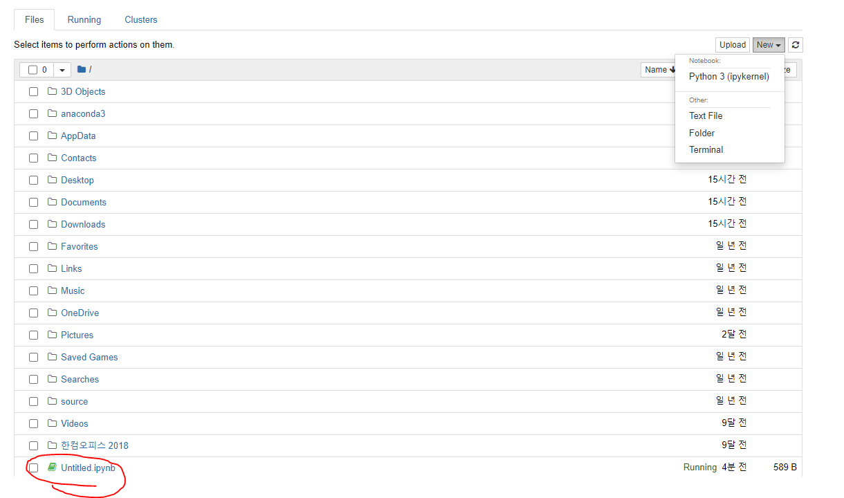
위와 같이 Untitled 라는 문서가 생성 된다.
1. Pandas 사용법
import pandas as pd
#pandas의 Dataframe을 생성한다.
names = ['Bob', 'Jessica','Mary','John','Mei']
births = [968, 155 , 77, 578, 973]
custom = [1,5,25,13,23232]
BabyDataSet =  list(zip(names,births))
df = pd.DataFrame(data = BabyDataSet , columns=['Names','Births'])
df.head()
결과 값
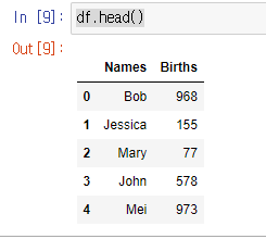
Pandas는 행과 열(엑셀 데이터)로 바꾸어 주는 역할을 해준다.
이제 Pandas 명령어를 알아보자.
1.df.dtypes
#데이터 프레임의 열 타입 정보를 출력한다.
print(df.dtypes)
결과 값

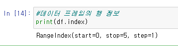
2.df.index
#데이터 프레임의 행 정보
print(df.index)
결과 값
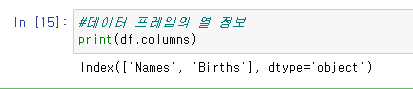
3.df.columns
#데이터 프레임의 열 정보
print(df.columns)
결과 값
4. zip(names.births)
import pandas as pd
#pandas의 Dataframe을 생성한다.
names = ['Bob', 'Jessica','Mary','John','Mei']
births = [968, 155 , 77, 578, 973]
custom = [1,5,25,13,23232]
for aa in zip(names,births):
      print(aa)
결과 값
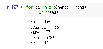
위와 같이 두개의 리스트를 zip이라는 함수에 넣으면 세로로 가공해준다.
이것을 리스트라는 함수로 다시 묶어버리면,

데이터 셋이 생성된다.
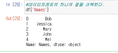
5.df['이름']
내가 만약 데이터 프레임에서 이름만 출력하고 싶다면,
#데이터 프레임의 하나의 열을 선택한다.
df['Names']
df['이름']을 넣으면 아래와 같이 하나의 열이 출력된다.
결과 값
마찬가지로,행의 0~3번째 인덱스를 선택하고 싶다면
df[0:3]결과 값

이런식으로 선택해서 출력 할 수 있다.
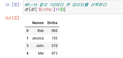
6. df[df['Births']>100] (조건문)
#Birth 열이 100보다 큰 데이터를 선택한다
df[df['Births']>100]
아래와 같이 df 안에 조건을 설정해 그 조건에 맞게 데이터를 출력 할 수 있다.
결과 값
#Birth 열이 100보다 큰 데이터를 선택한다
df[df['Births']>100].head(2)
결과 값
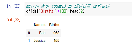
head를 추가하여 상위 2개만 보이도록 할 수 도있다.
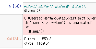
7.mean() : 데이터 프레임의 평균값을 계산한다.
#데이터 프레임의 평균값을 계산한다.
df.mean()
결과 값
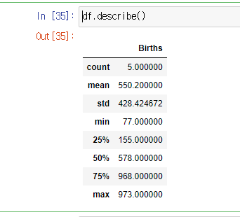
8. df.describe() : 각 데이터의 평균값을 요약해 나타 내준다.
df.describe()결과 값
2. Numpy 사용법
Numpy는 벡터나 행렬 연산을 위한 라이브러리이다!
1.arrange, reshape
import numpy as np

arr1 = np.arange(15).reshape(3,5)
print(arr1)
np.arange(15).reshape(3,5)
: 0~ 14까지의 숫자를 2차원 배열로 나타 내준다.
결과 값

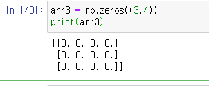
2. zeros : 행렬의 모든 데이터를 0으로 만드는 함수이다.
arr3 = np.zeros((3,4))
print(arr3)
3행4열의 데이터가 모두 0인 행렬이 나온다.
결과 값
3. ones: 행렬의 모든 데이터를 1으로 만드는 함수이다.
arr3 = np.ones((3,4))
print(arr3)
3행4열의 데이터가 모두 1인 행렬이 나온다.
결과 값

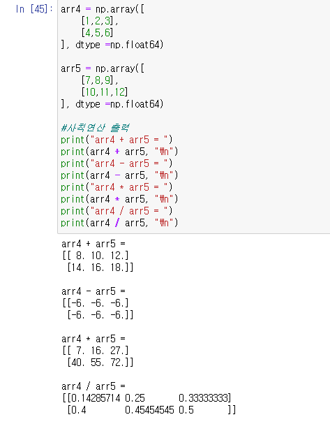
4. 사칙연산 ( 행렬끼리 계산을 할때는 전부 shape이 맞아야 한다!)
arr4 = np.array([
    [1,2,3],
    [4,5,6]
], dtype =np.float64)

arr5 = np.array([
    [7,8,9],
    [10,11,12]
], dtype =np.float64)

#사칙연산 출력
print("arr4 + arr5 = ")
print(arr4 + arr5, "\n")
print("arr4 - arr5 = ")
print(arr4 - arr5, "\n")
print("arr4 * arr5 = ")
print(arr4 * arr5, "\n")
print("arr4 / arr5 = ")
print(arr4 / arr5, "\n")
결과 값
3. Matplotlib 사용법
1. 선언하기
%matplotlib inline
import matplotlib.pyplot as plt
Jupyter 노트북에서 matplotlib 사용시, 맨 윗줄에 %matplotlib inline 으로 선언 해줘야 한다.
2.데이터를 가지고 막대 그래프 출력하기
y = df['Births']
x = df['Names']

#bar plot을 출력한다.
plt.bar(x,y) #--> 막대그래프 객체 생성
plt.xlabel('Names') #--> x축 제목
plt.ylabel('Briths') #--> y축 제목
plt.title('Bar plot') #--> 그래프 제목
plt.show() #--> 그래프 출력
Births 데이터와 Names 데이터를 받아와 막대 그래프를 출력한다.
결과 값

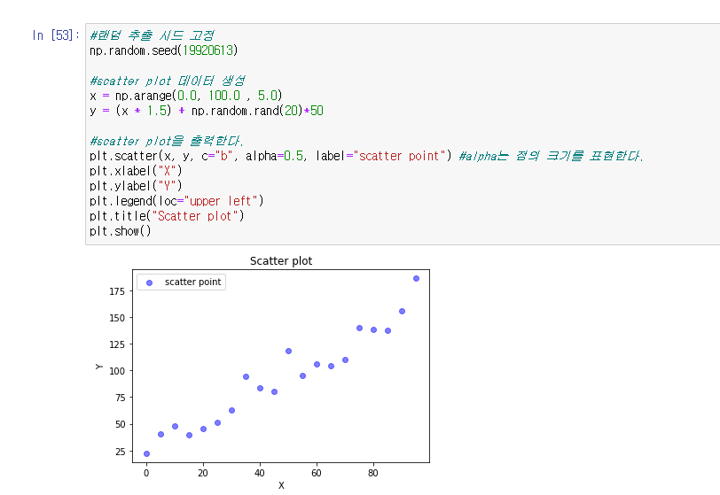
3.scatter plot 그래프 출력하기
#랜덤 추출 시드 고정
np.random.seed(19920613)

#scatter plot 데이터 생성
x = np.arange(0.0, 100.0 , 5.0)
y = (x * 1.5) + np.random.rand(20) + 50

#scatter plot을 출력한다.
plt.scatter(x, y, c="b", alpha=0.5, laber="scatter plot") #alpha는 점의 크기를 표현한다.
plt.xlabel("X")
plt.ylabel("Y")
plt.legend(loc="upper left")
plt.title("Scatter plot")
plt.show()
결과 값
'프로그래밍 > Python 데이터 분석' 카테고리의 다른 글
| #1 주피터,아나콘다 환경 만들기 (0) | 2022.07.05 |
|---|
